Brand Guides
Our brand guidelines are published to provide clarity and guardrails as to how the Mazzella Companies’ brands should be utilized for all applications — print or digital.
Select Your Brand Guide:

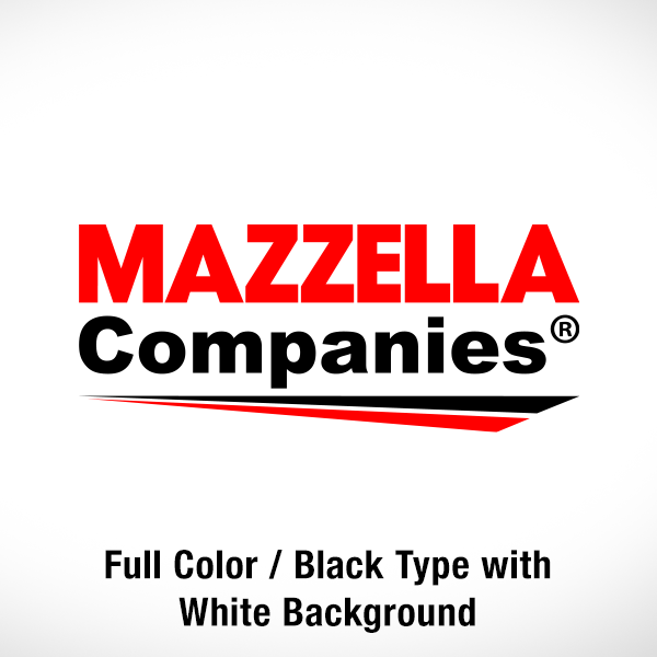
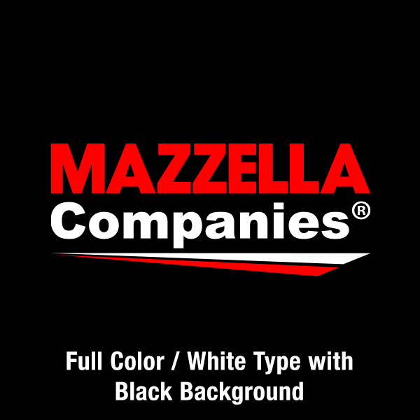
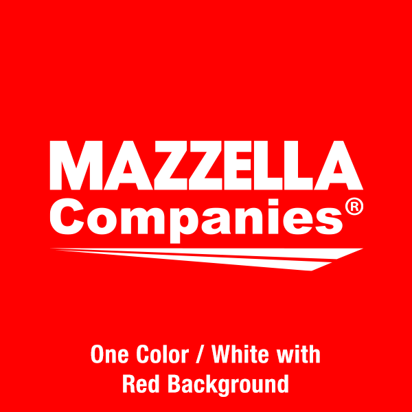
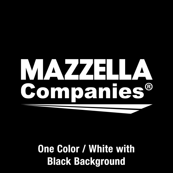
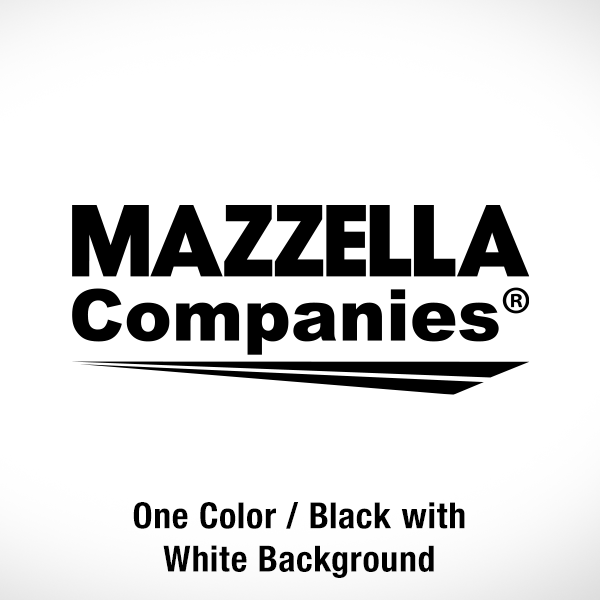
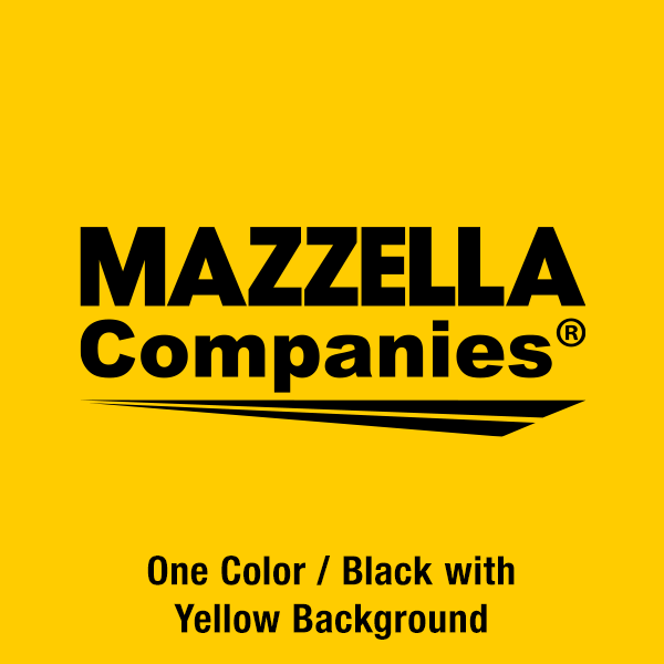
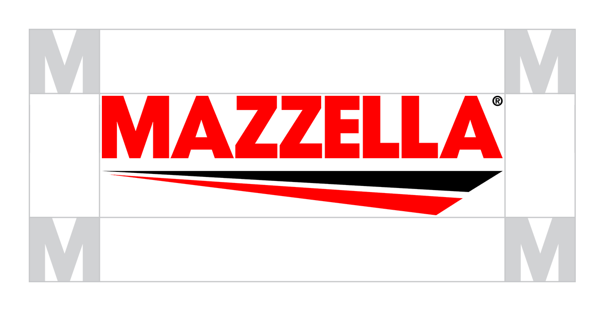
Correct Logo Usage
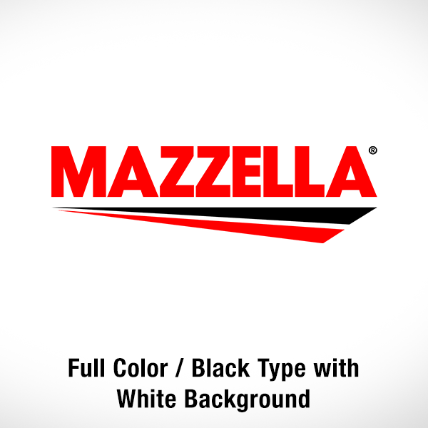
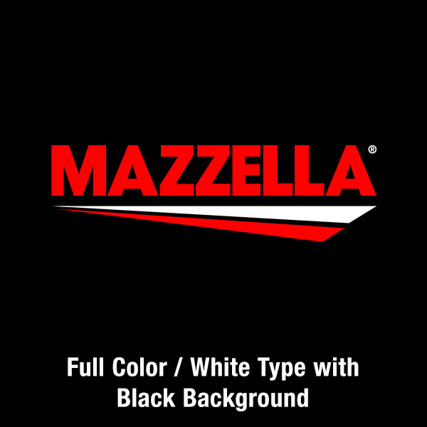
The Mazzella Companies logo may only be used in full color (black and white type), black, or white variations. The full color (black type) and black logos should be used on white or light-colored backgrounds, and the full color (white type) and white logo should be used on dark-colored backgrounds or contrasting duo-tone photography. All examples shown below are deemed acceptable.
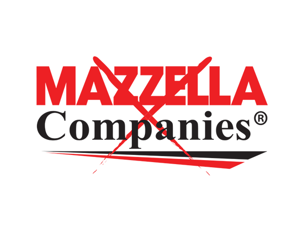
Incorrect Logo Usage
Any unauthorized alteration or modification of the Mazzella Companies logo is strictly prohibited. The below examples show how NOT to use the Mazzella Companies logo. All examples below are deemed unacceptable.
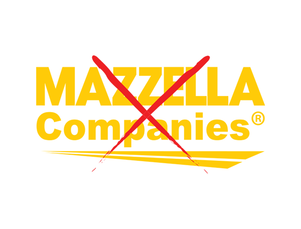
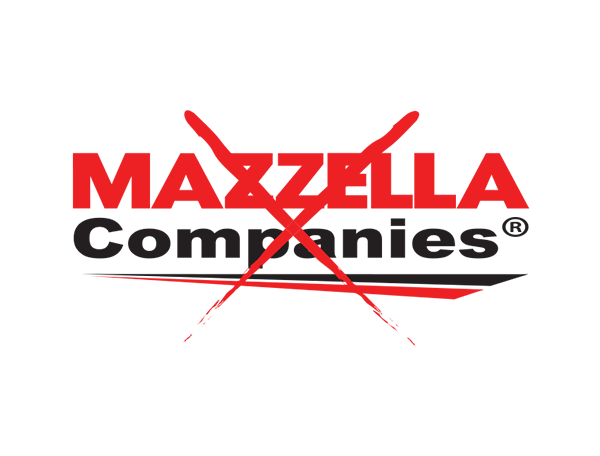
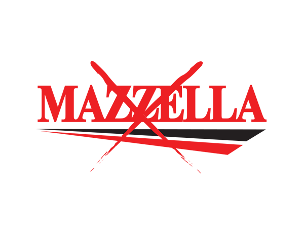
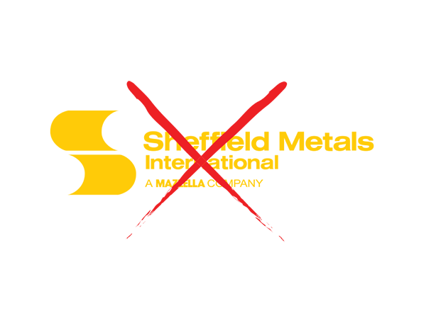
The color of the logo may not be changed. White and black versions are available for special circumstances.
No part of the logo may be scaled in such a way that distorts the original size ratio.
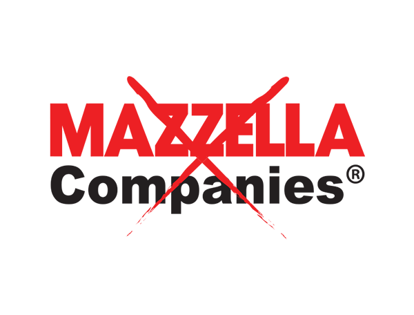
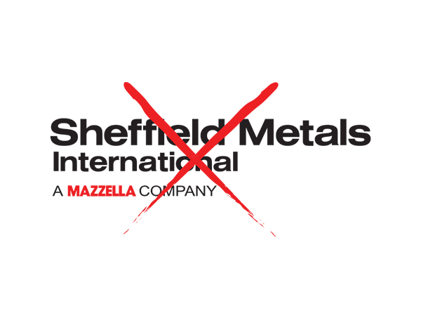
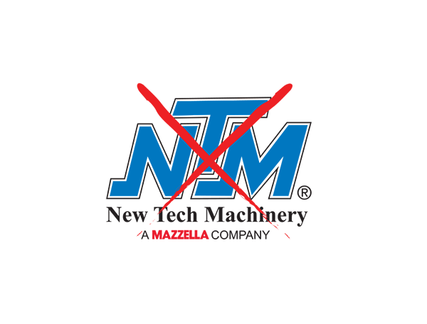
Do not use older versions of the logo or remove graphic elements from any portion of the logo.
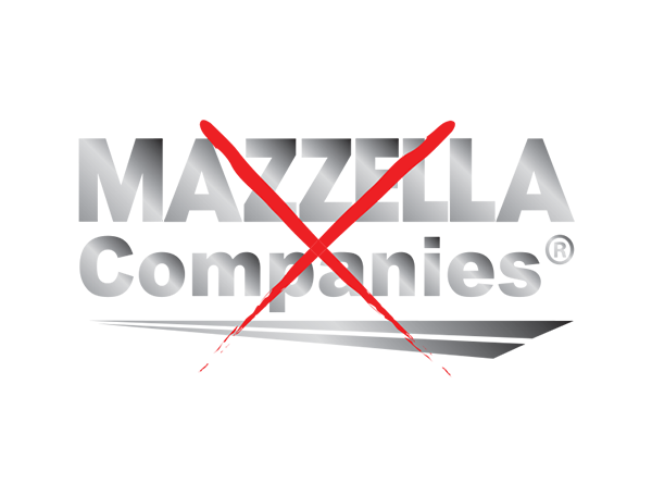
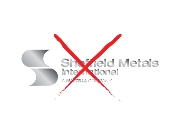
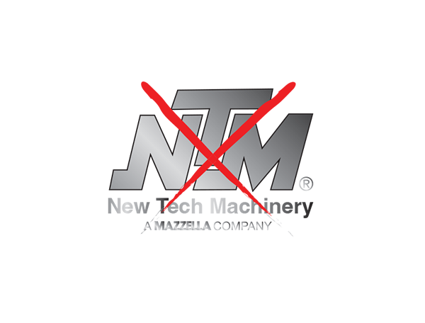
No gradients may be applied to the logo.
No typefaces on the logo may be changed or altered.
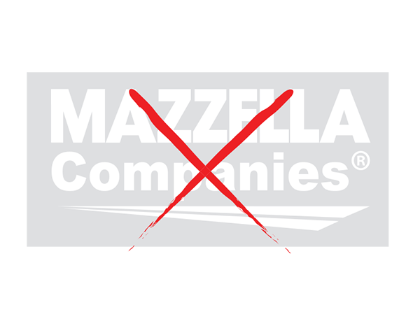
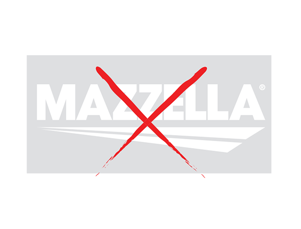
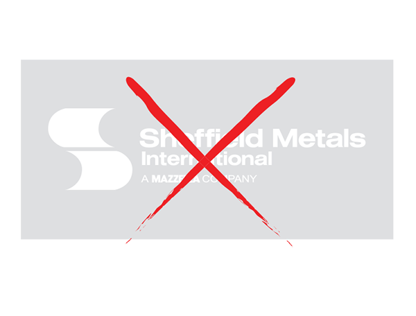
A white logo may not be used on a light-colored background.
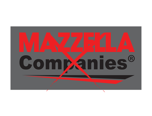
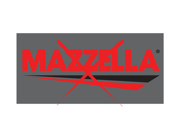
The full color or black logo may not be used on a dark-colored background.
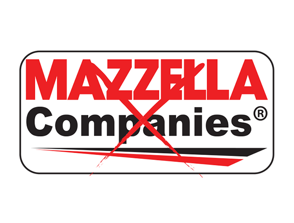
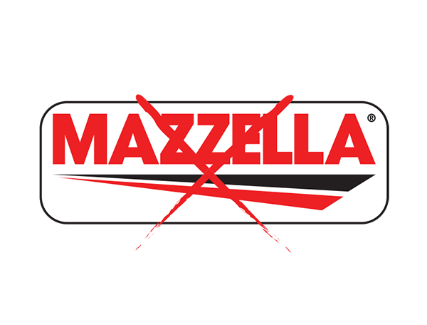
Avoid placing the logo inside shapes. When necessary, make sure it is surrounded by ample negative space.
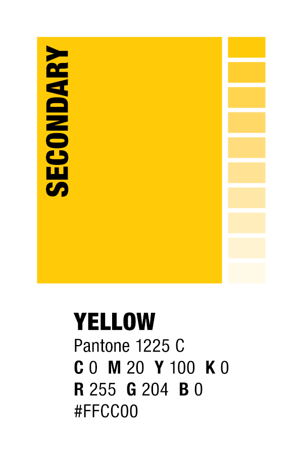
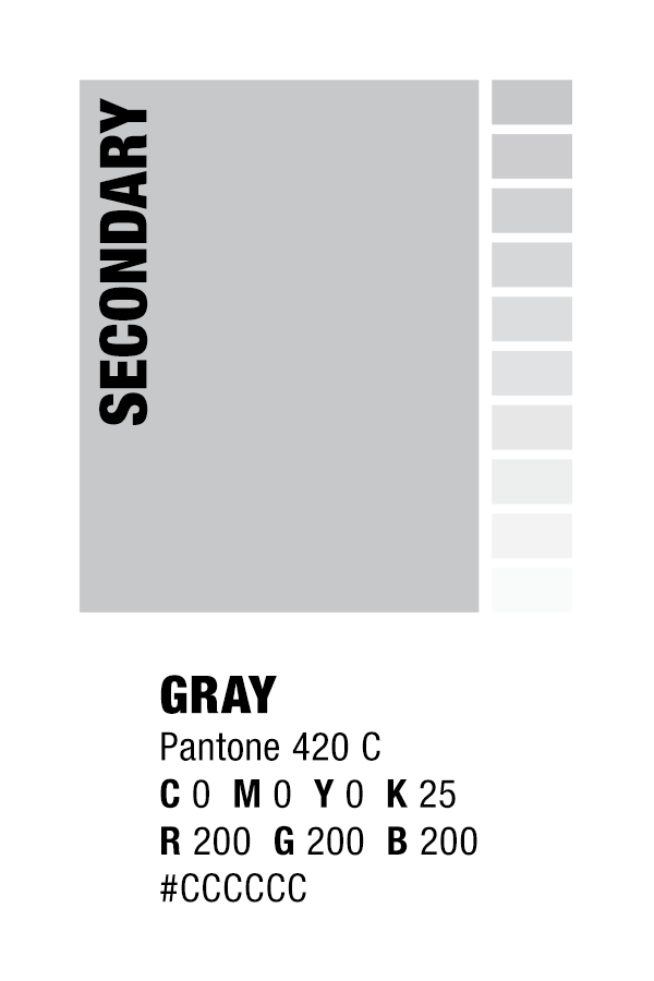
Color Usage
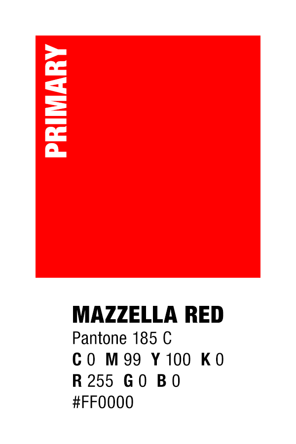
The Mazzella Companies primary brand colors are Mazzella Red and Black, while secondary colors are yellow and gray. These colors may be used in conjunction with white and/or any tint of black. Please note: Mazzella Red should not utilize tints, as they will begin to stray from the primary brand color specification.


Negative Space
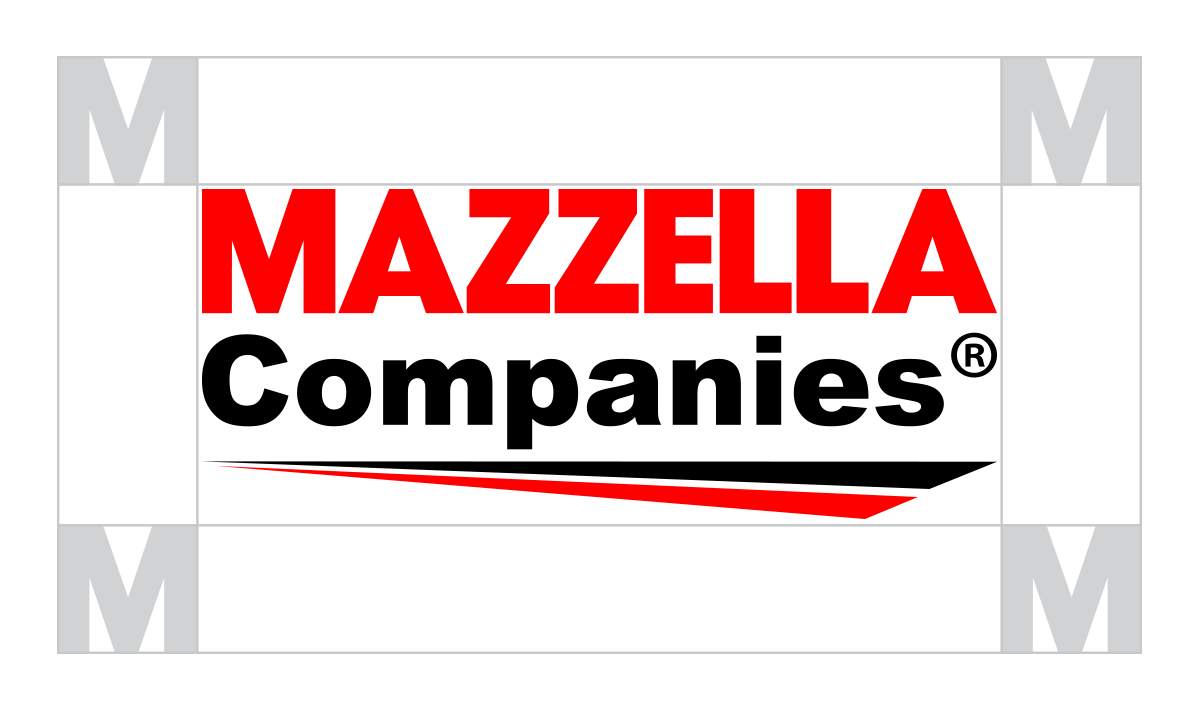
Ample negative space should surround the logo at all times. Spacing around all sides of the logo must be (at least) equivalent to the height and width of the “M” in the Mazzella name. The size of the “M” used for reference shall be determined by the scale at which the logo is placed.
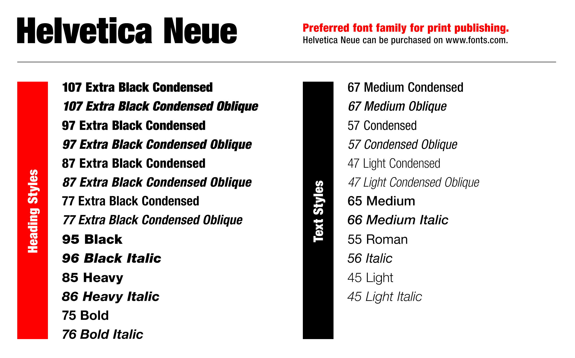
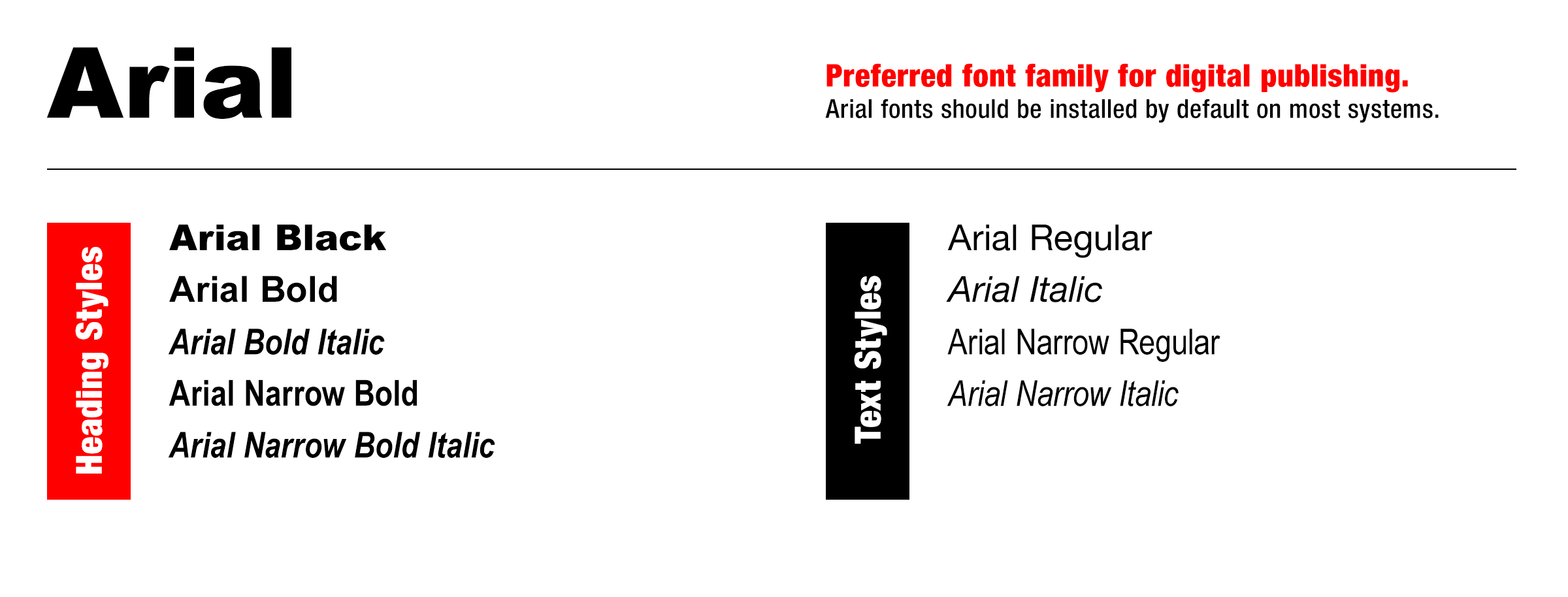
Font Usage
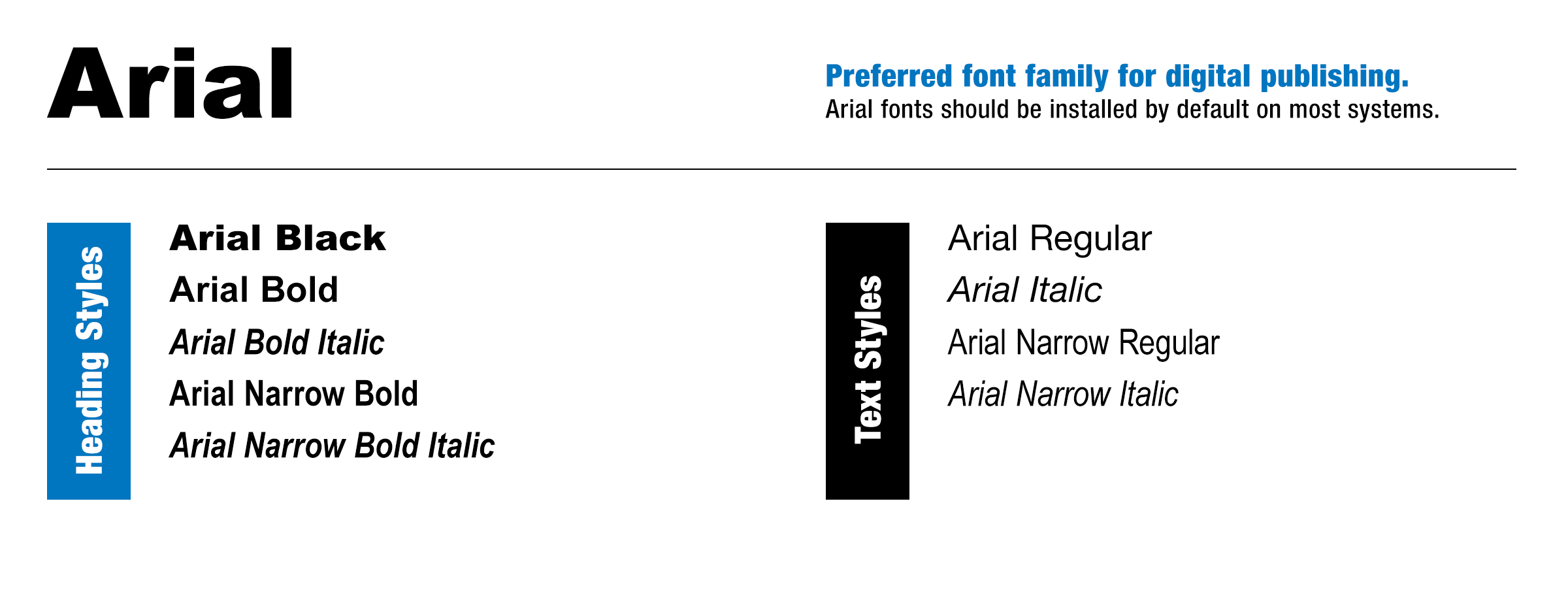
The Mazzella Companies preferred typeface is Helvetica Neue. This font family is to be used on all internal and external print and digital collateral. For web, Arial is acceptable. For exceptions that require usage of other fonts, please contact Mazzella Companies’ Corporate Marketing.


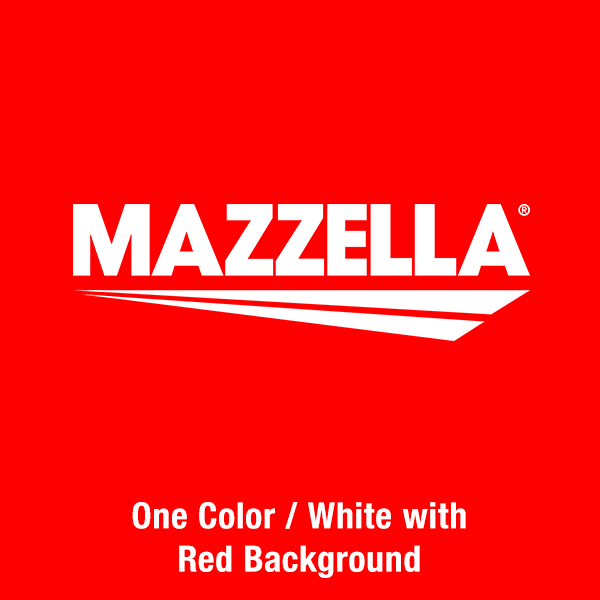
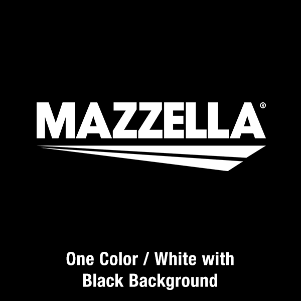
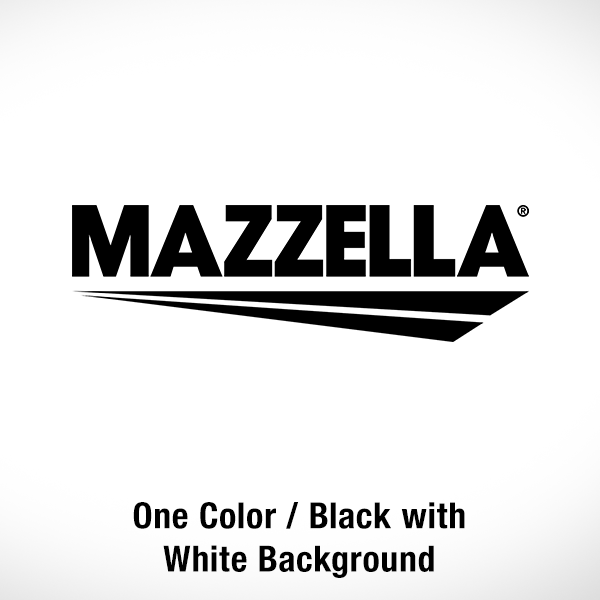
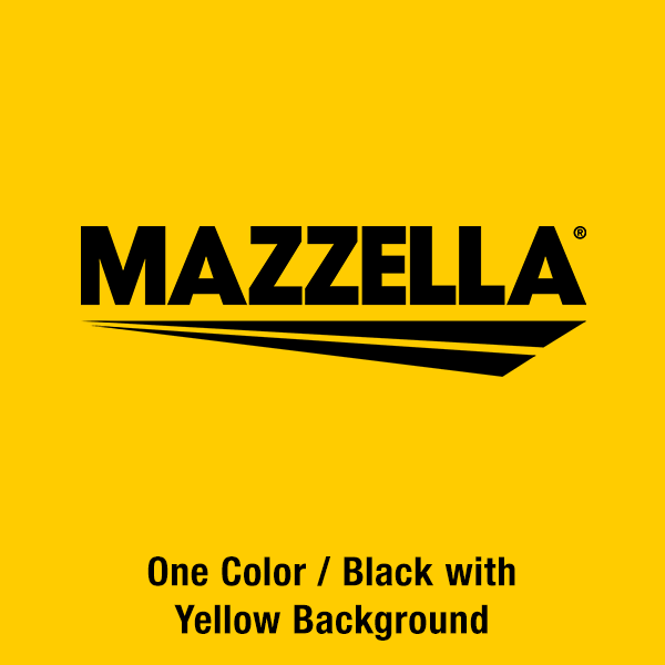
Correct Logo Usage
The Mazzella logo may only be used in full color (black and white type), black, or white variations. The full color (black type) and black logos should be used on white or light-colored backgrounds, and the full color (white type) and white logo should be used on dark-colored backgrounds or contrasting duo-tone photography. All examples shown below are deemed acceptable.
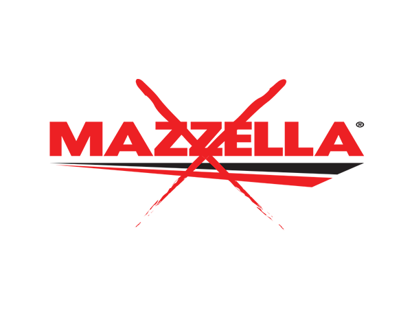
Incorrect Logo Usage
Any unauthorized alteration or modification of the Mazzella logo is strictly prohibited. The below examples show how NOT to use the Mazzella logo. All examples below are deemed unacceptable.
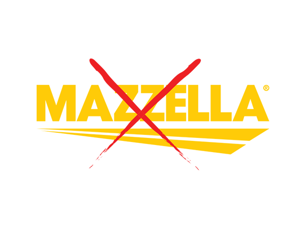
The color of the logo may not be changed. White and black versions are available for special circumstances.
No part of the logo may be scaled in such a way that distorts the original size ratio.
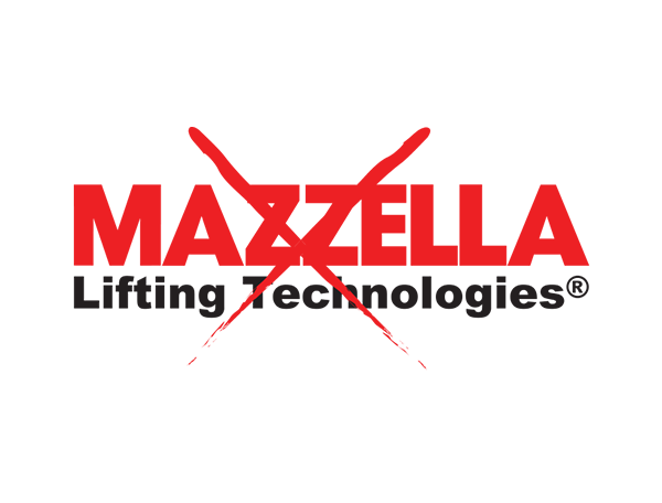
Do not use older versions of the logo or remove graphic elements from any portion of the logo.
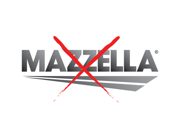
No gradients may be applied to the logo.
No typefaces on the logo may be changed or altered.
A white logo may not be used on a light-colored background.
The full color or black logo may not be used on a dark-colored background.
Avoid placing the logo inside shapes. When necessary, make sure it is surrounded by ample negative space.
Color Usage
The Mazzella primary brand colors are Mazzella red and black, while secondary colors are yellow and gray. These colors may be used in conjunction with white and/or any tint of black. Please note: Mazzella red should not utilize tints, as they will begin to stray from the primary brand color specification.


Negative Space
Ample negative space should surround the logo at all times. Spacing around all sides of the logo must be (at least) equivalent to the height and width of the “M” in the Mazzella name. The size of the “M” used for reference shall be determined by the scale at which the logo is placed.
Font Usage
The Mazzella preferred typeface is Helvetica Neue. This font family is to be used on all internal and external print and digital collateral. For web, Arial is acceptable. For exceptions that require usage of other fonts, please contact Mazzella Companies’ Corporate Marketing.
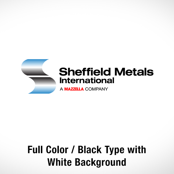
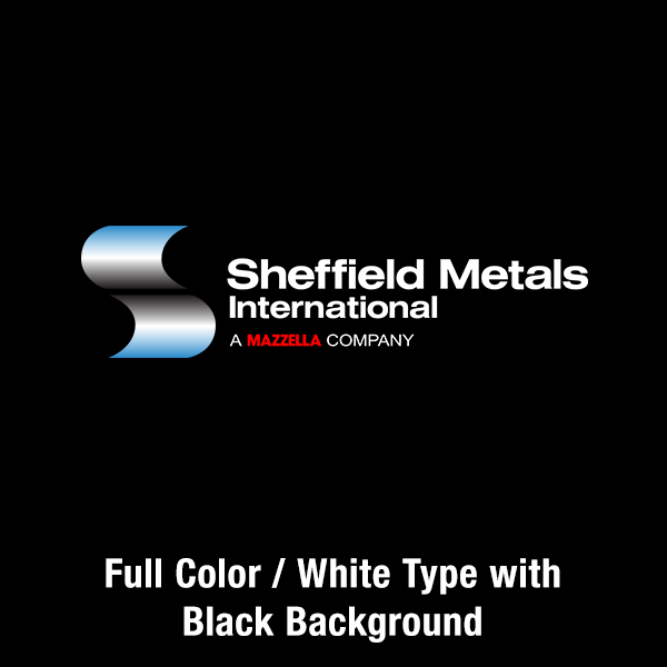
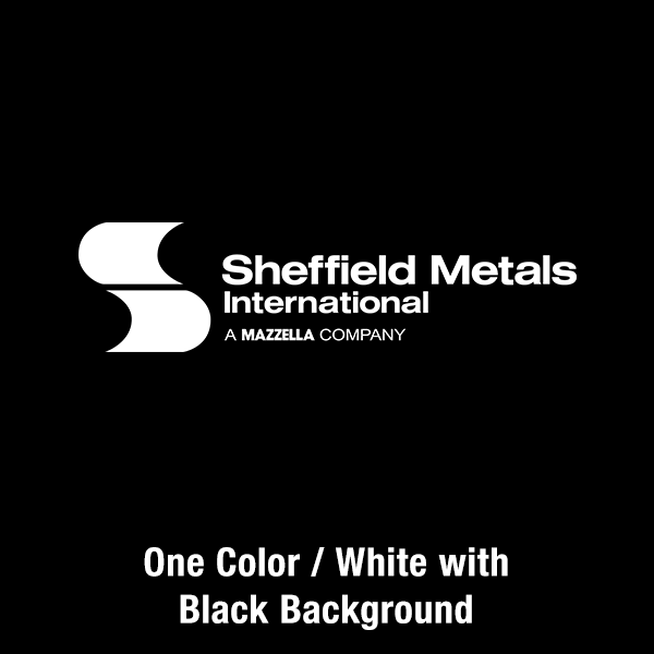
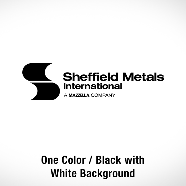
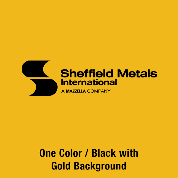
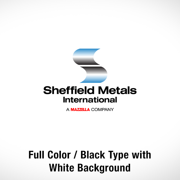
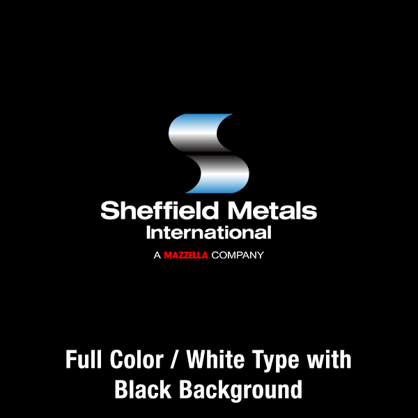
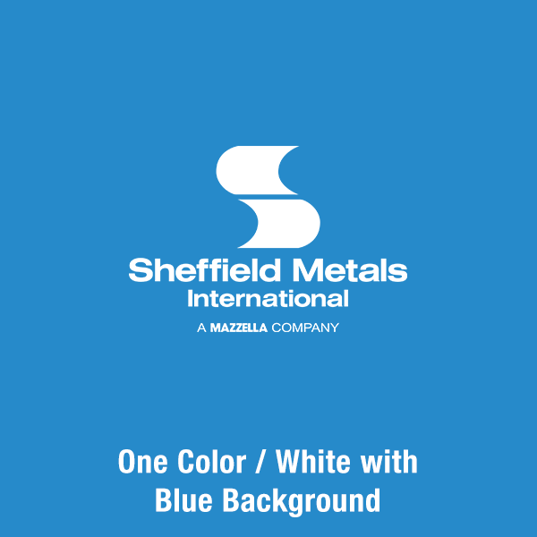
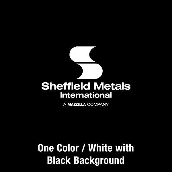
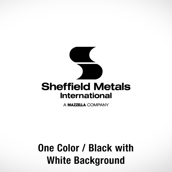
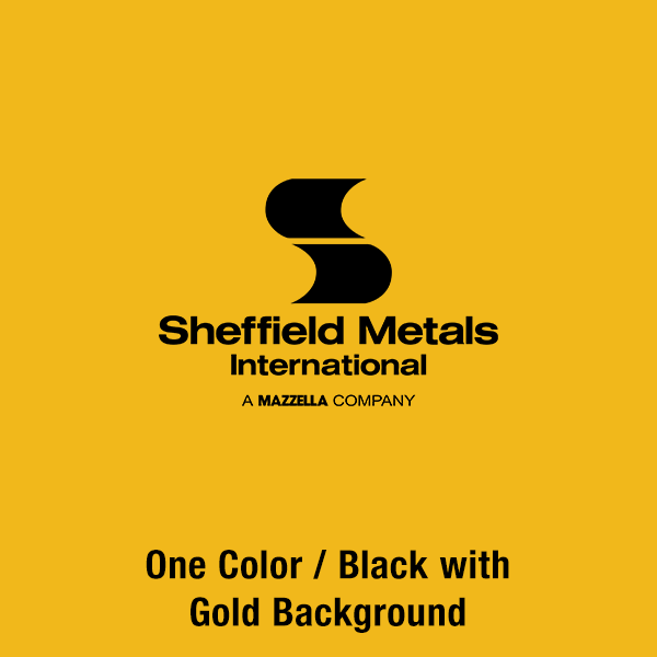
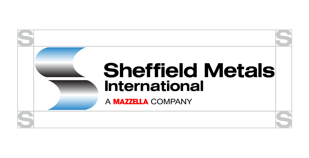
Correct Logo Usage
Our logos may only be used in full color (black and white type), black, or white variations. The full color (black type) and black logos should be used on white or light-colored backgrounds, and the full color (white type) and white logo should be used on dark-colored backgrounds or contrasting duo-tone photography. All examples shown below are deemed acceptable.
Primary Logo Usage:

Secondary Logo Usage:
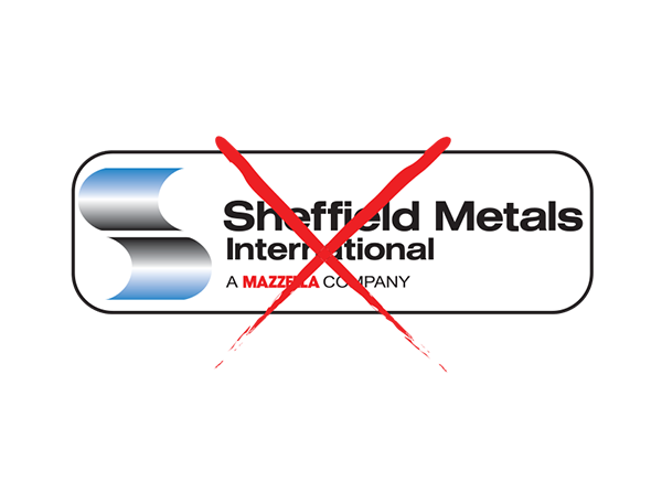
Incorrect Logo Usage
Any unauthorized alteration or modification of the Sheffield Metals logo is strictly prohibited. The below examples show how NOT to use the Sheffield Metals logo. All examples below are deemed unacceptable.
The color of the logo may not be changed. White and black versions are available for special circumstances.

No part of the logo may be scaled in such a way that distorts the original size ratio.
Do not use older versions of the logo or remove graphic elements from any portion of the logo.
No gradients may be applied to the logo.

No typefaces on the logo may be changed or altered.
A white logo may not be used on a light-colored background.

The full color or black logo may not be used on a dark-colored background.
Avoid placing the logo inside shapes. When necessary, make sure it is surrounded by ample negative space.
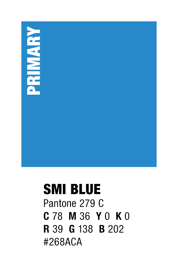
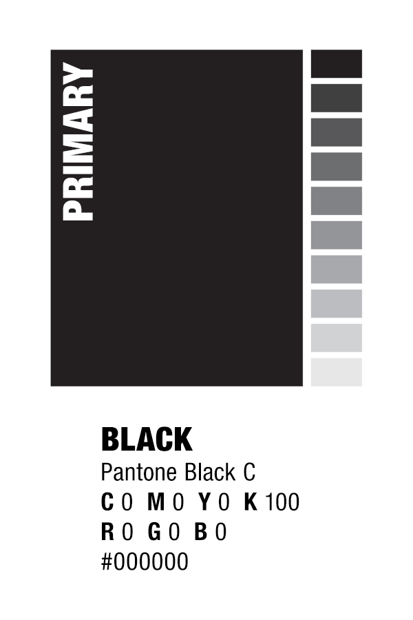
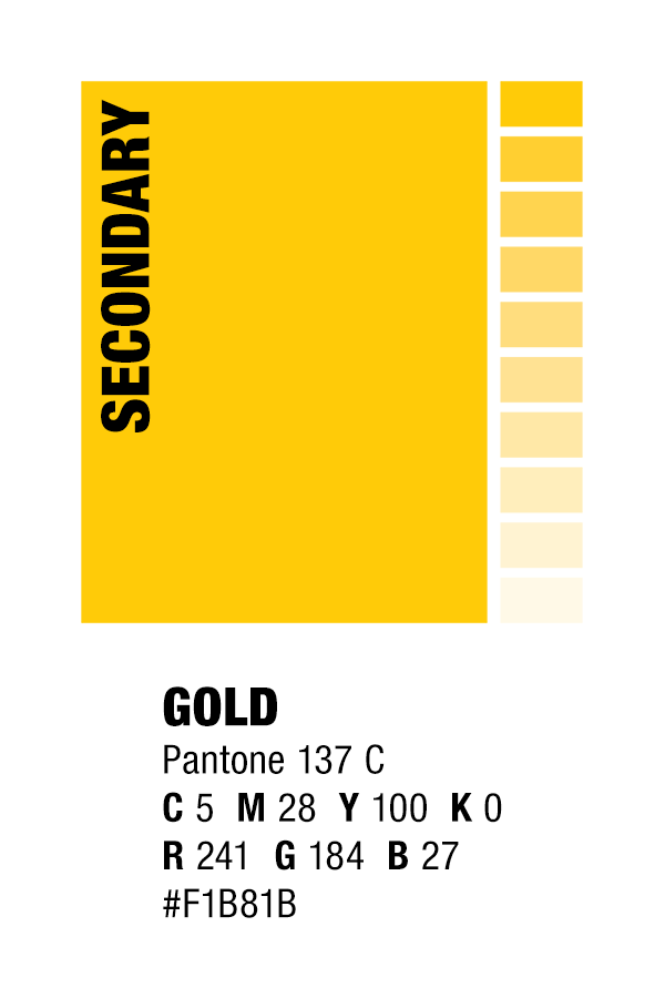
Color Usage
The Sheffield Metals primary brand colors are Sheffield Metals blue and black, while secondary colors are gold and Mazzella red. These colors may be used in conjunction with white and/or any tint of black. Please note: Mazzella red should be utilized only in the logo byline and should not utilize tints, as they will begin to stray from the primary brand color specification.

Negative Space
Ample negative space should surround the logo at all times. Spacing around all sides of the logo must be (at least) equivalent to the height and width of the “S” in the Sheffield Metals’ name. The size of the “S” used for reference shall be determined by the scale at which the logo is placed.
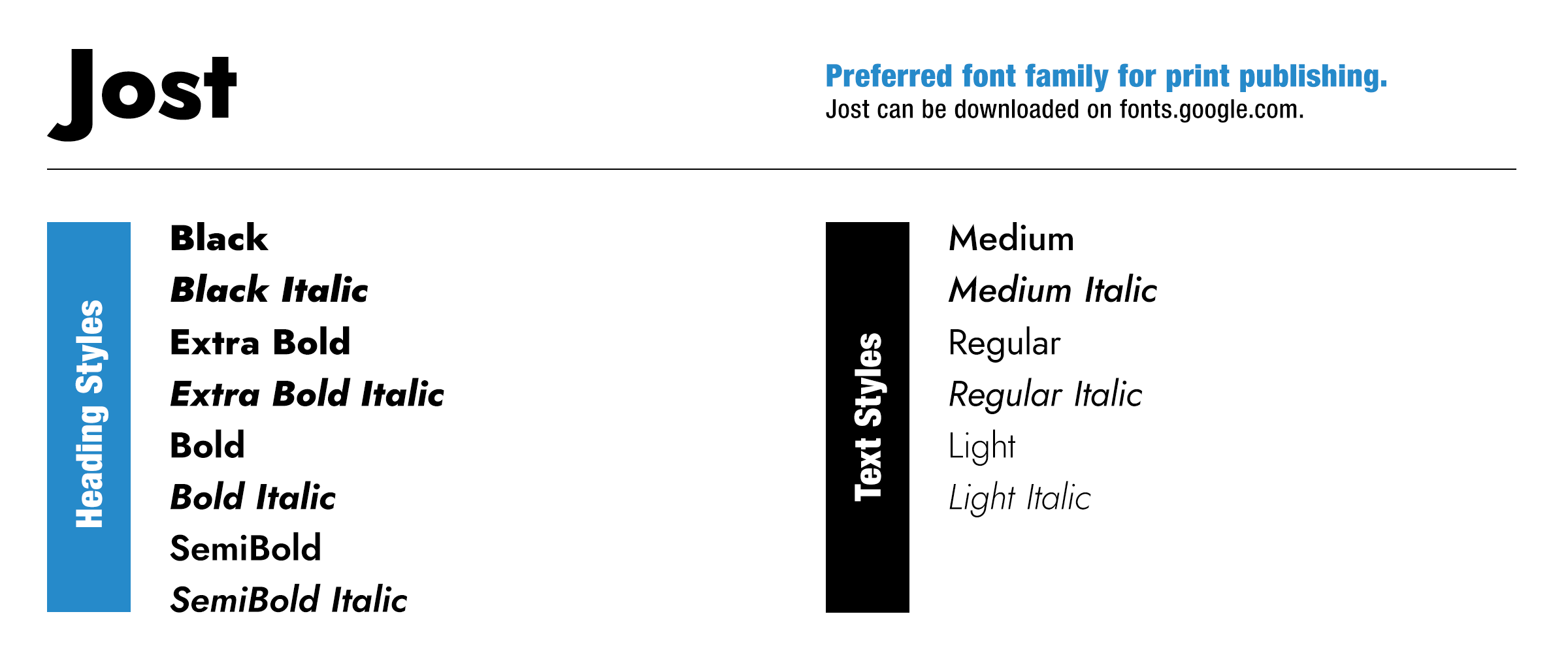
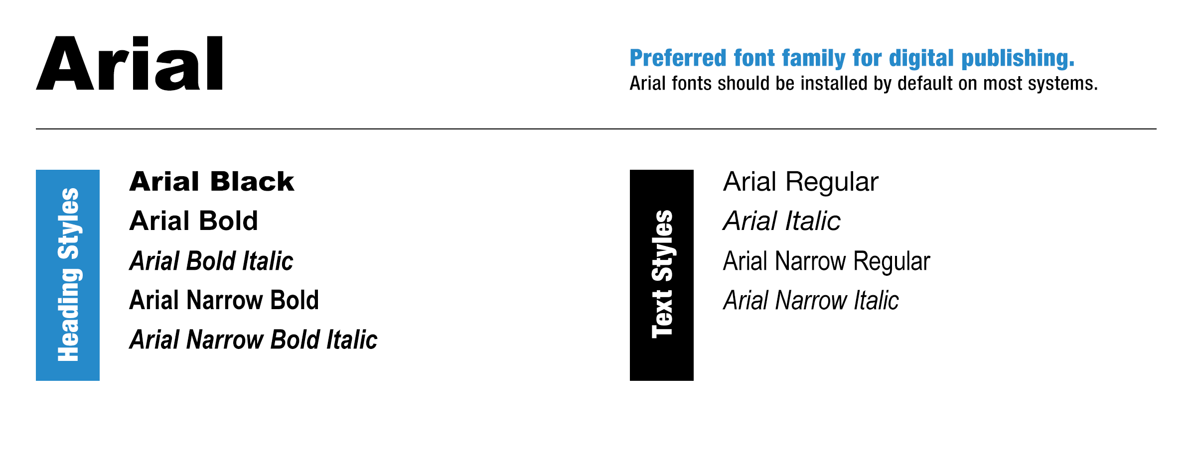
Font Usage
The Sheffield Metals preferred typeface is Jost. This font family is to be used on all internal and external print and digital collateral. For web, Arial is acceptable. For exceptions that require usage of other fonts, please contact Mazzella Companies’ Corporate Marketing.

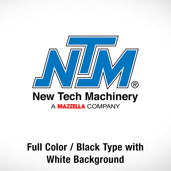
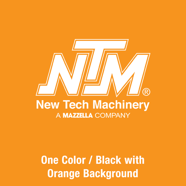
Correct Logo Usage
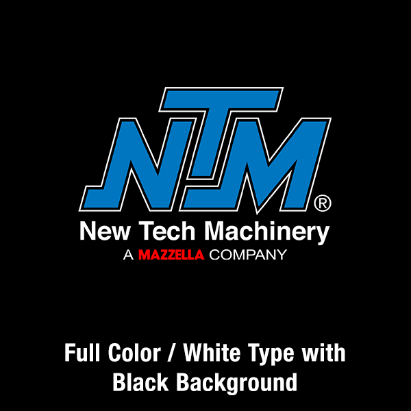
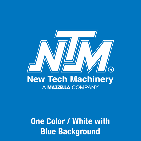
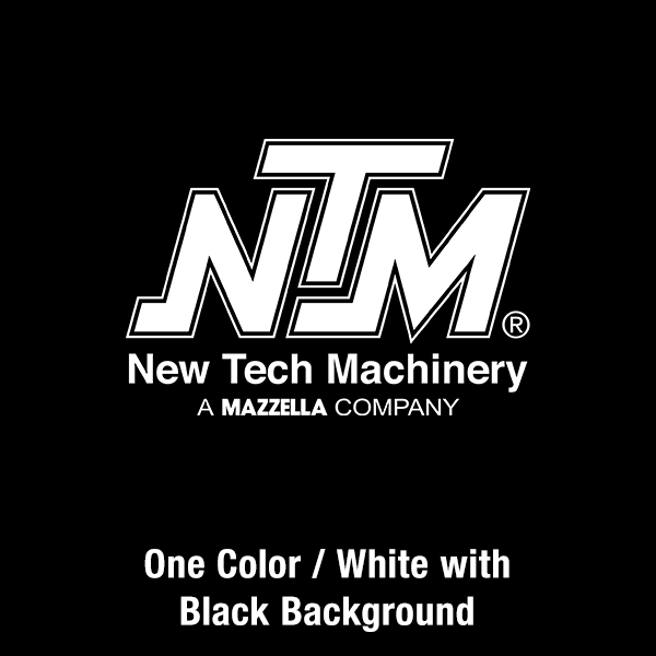
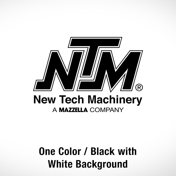
The New Tech Machinery logo may only be used in full color (black and white type), black, or white variations. The full color (black type) and black logos should be used on white or light-colored backgrounds, and the full color (white type) and white logo should be used on dark-colored backgrounds or contrasting duo-tone photography. All examples shown below are deemed acceptable.
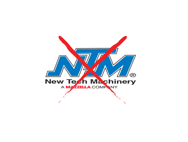
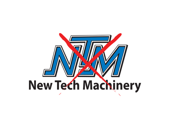
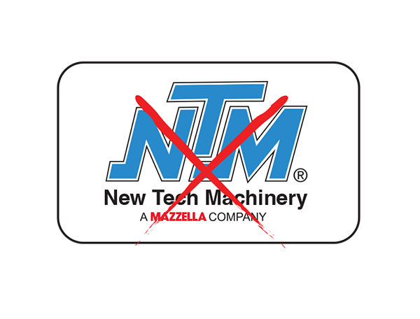
Incorrect Logo Usage
Any unauthorized alteration or modification of the New Tech Machinery logo is strictly prohibited. The below examples show how NOT to use the New Tech Machinery logo. All examples below are deemed unacceptable.
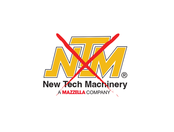
The color of the logo may not be changed. White and black versions are available for special circumstances.
No part of the logo may be scaled in such a way that distorts the original size ratio.
Do not use older versions of the logo or remove graphic elements from any portion of the logo.
No gradients may be applied to the logo.
No typefaces on the logo may be changed or altered.
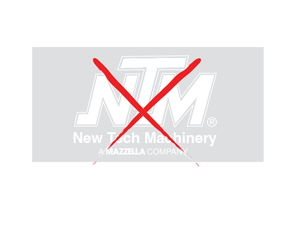
A white logo may not be used on a light-colored background.
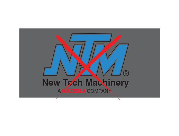
The full color or black logo may not be used on a dark-colored background.
Avoid placing the logo inside shapes. When necessary, make sure it is surrounded by ample negative space.
Color Usage
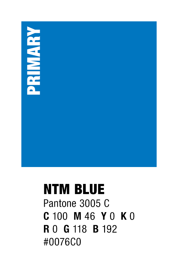
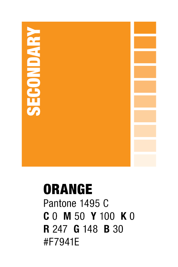
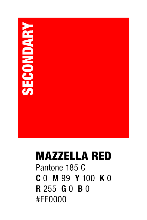
The New Tech Machinery primary brand colors are New Tech Machinery blue and black, while secondary colors are orange and Mazzella red. These colors may be used in conjunction with white and/or any tint of black. Please note: Mazzella red should be utilized only in the logo byline and should not utilize tints, as they will begin to stray from the primary brand color specification.

Negative Space
Ample negative space should surround the logo at all times. Spacing around all sides of the logo must be (at least) equivalent to the height and width of the “N” in the New Tech Machinery’s name. The size of the “N” used for reference shall be determined by the scale at which the logo is placed.
Font Usage
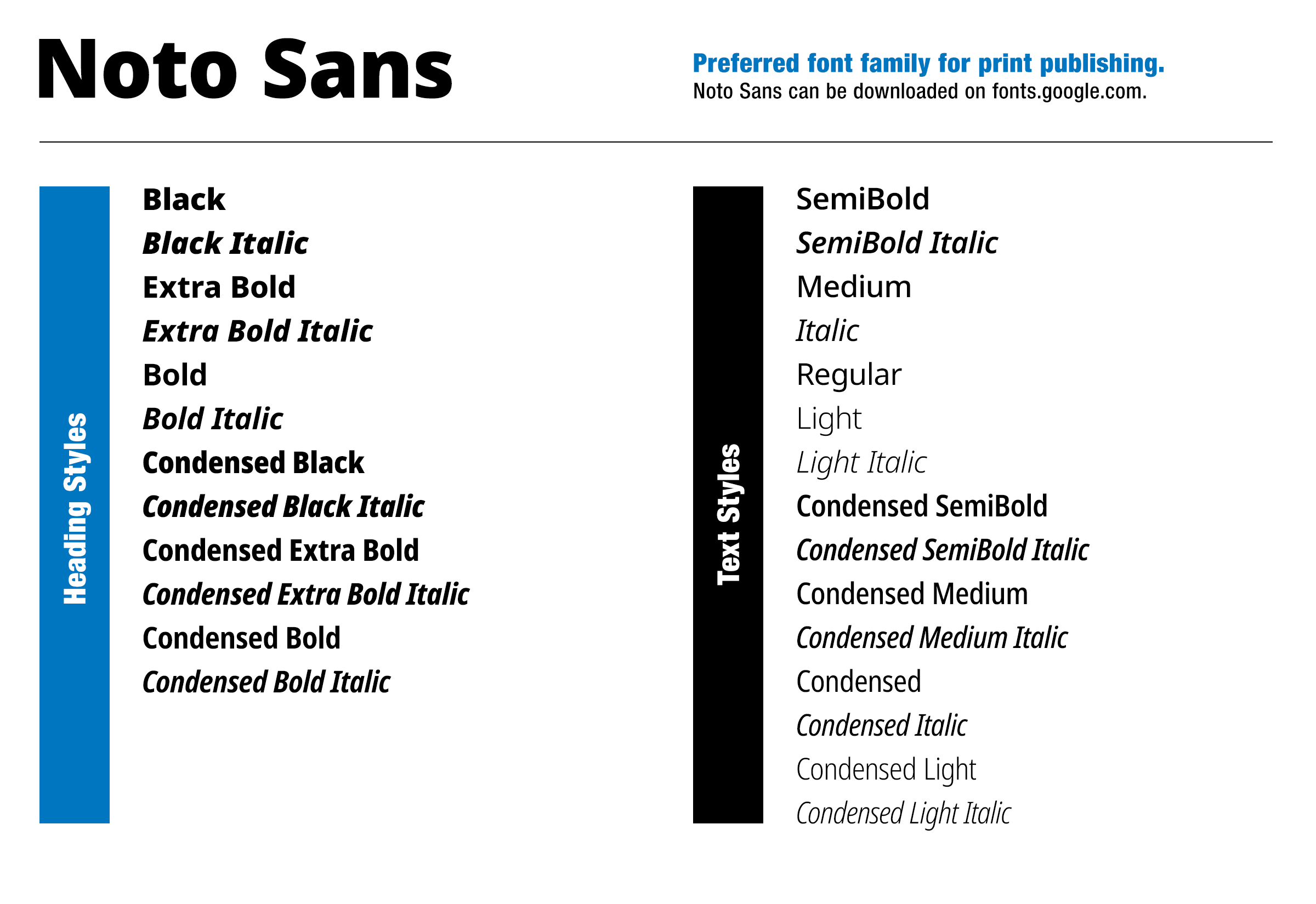
The New Tech Machinery preferred typeface is Noto Sans. This font family is to be used on all internal and external print and digital collateral. For web, Arial is acceptable. For exceptions that require usage of other fonts, please contact Mazzella Companies’ Corporate Marketing.